Research has proven that certain colors will elicit certain emotions.
But…there are so many variables involved when specifying color.
One of the first questions we always ask our clients is “How do you want to feel in your space?”
We start by grouping colors as Cool versus Warm:
Cool colors are purples, blues and green – We have experience with these colors as having healing and calming influences and are stress-reducing.
Warm colors – reds, oranges and yellows – tend to induce excitement, increase blood pressure but can also cause fatigue without the balance of cool colors.
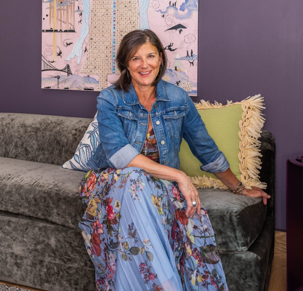
Follow us on Facebook and Instagram to see how we design with warm versus cool colors to evoke different emotions. The example in this Bergen County home is an example of how we added warmth to this client’s family room.

Our interiors are designed to be highly personal. We ensure that you’re surrounded with design that’s meaningful and represents you authentically—so that you’ll thrive. Give us a call or email us. We’d love to get to know you and help you create an uplifting environment.


