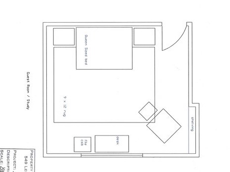
We started with measuring and drafting up a basic scaled floor plan. Our client already had the majority of what she needed for the space, so our job was to interject color, personality and to create a space that flowed with the rest of the house.
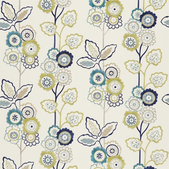
We decided to use this embroidered floral fabric on the window treatments. Simple panels on a rod with black out lining were chosen. This fabric’s vibrant colors make such a statement and need no additional embellishments. The once dark green walls were replaced with the office white ground found in the fabric. We used a no VOC paint.
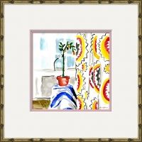
We discovered (and fell in love with) this artwork at High Point Market on our most recent trip. A trio above the headboard injects color and joy to this space.
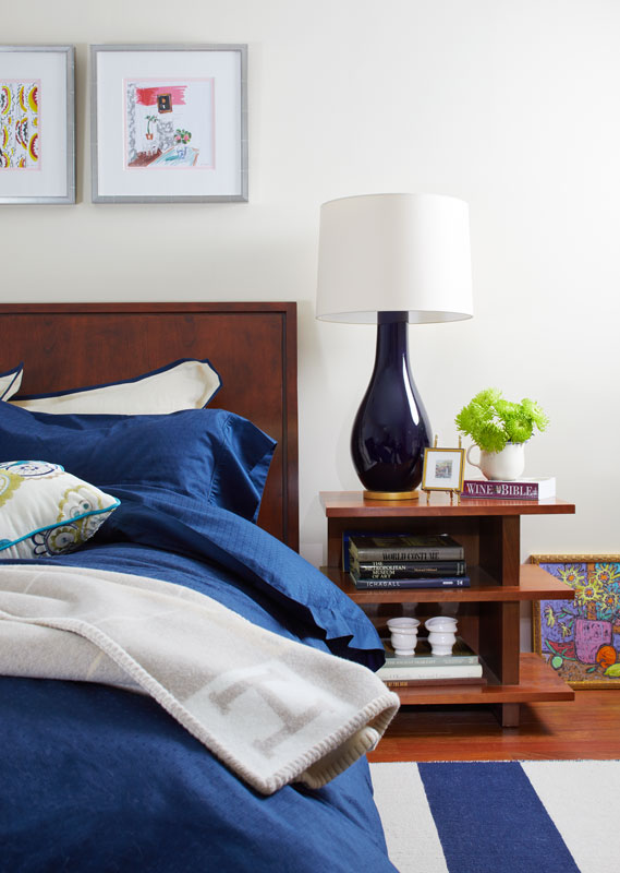
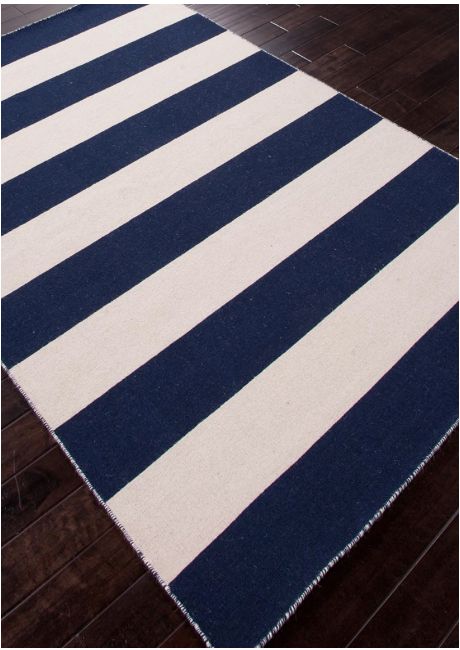
An overscaled wool navy striped rug was chosen to ground the space and balance the scale of the floral embroidered panels. The bedside lamps we chose were a perfect indigo blue.
We were fortunate to be able to use the client’s chair and ottoman. The vibrant Hermes boxes were pulled from storage and used as an accent and accessory in this space. The last piece to this space was the artwork above the chair that blended perfectly with the two!

