Apartment Therapy – Pros Weigh In: These Are The Best Paint Colors For Your Kitchen
Years ago most kitchens were dark and full of autumn tones, like red, gold, and even orange. More recently, those bolder shades have given way to all-white kitchens. Why? Homeowners are building and renovating kitchens to be open to the rest of the floorplan, rather than segmented.
“Kitchens have basically become invisible to blend with the rest of the home. That really affects the paint you’re going to choose—the color has to flow effortlessly,” says Sarah Fishburne, director of trend and design at The Home Depot. “Before when [the kitchen] was segmented, you could paint a kitchen one color and the dining room another.”
Lighter colors also help open up the space. “The general rule of thumb is to keep it light and neutral: Think white, light blue, even pale yellow. These colors will make the room look bigger, bring light into the space, and make the kitchen look and feel clean,” says Abra Landau, resident design expert at Fashion Furniture. “Don’t forget that your kitchen is not only a room for entertaining, but also a workspace that you want to keep looking as tidy as possible.”
But all-white certainly doesn’t mean drab—or even monotone. While walls are more muted, homeowners are having fun by experimenting with color on cabinets, doors, trim, and even ceilings. “Consumers are embracing colors in different ways, and they aren’t afraid of it,” Fishburne says. “It’s more individualized and intensified than ever before.”
Still, paint colors are fickle, and it’s tricky to find the right shade. So we asked the pros to help us wade through thousands of hues to find the best paint colors for a kitchen. The tones are mostly soft and light—grays, blues, whites, and taupe—but there are a few wildcards in the mix for those who want to step outside the box.
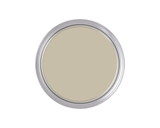
“Farrow & Ball Shaded White is a favorite neutral for kitchens. It can be paired with just about any color on cabinets and still feel clean and light.” —Marika Meyer, designer
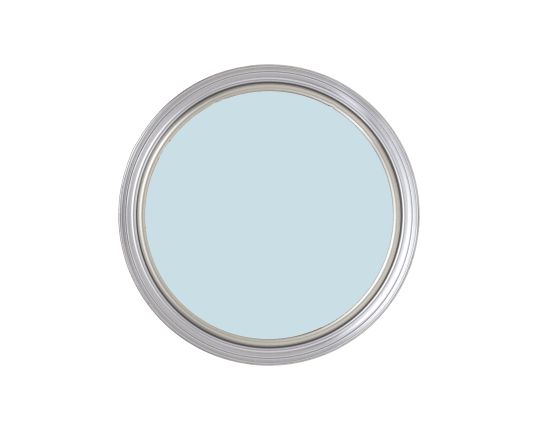
Benjamin Moore Breath of Fresh Air
“A light blue with a bit of turquoise such as Benjamin Moore Breath of Fresh Air can open up a tiny kitchen. The watery sky color looks amazing with white or light maple cabinets.” —Leslie Saul, designer
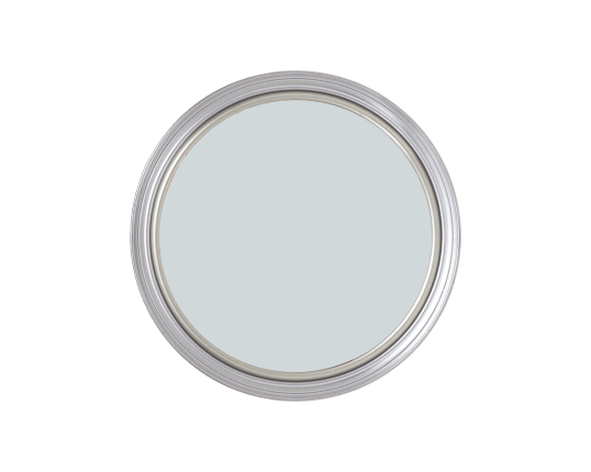
“One of our favorite go-to colors in a kitchen is Farrow & Ball Borrowed Light. Depending on the direction of light, this blueish gray is neither too light nor too dark. It is the perfect backdrop against a light or dark countertop or cabinetry.” —Terri Fiori, designer
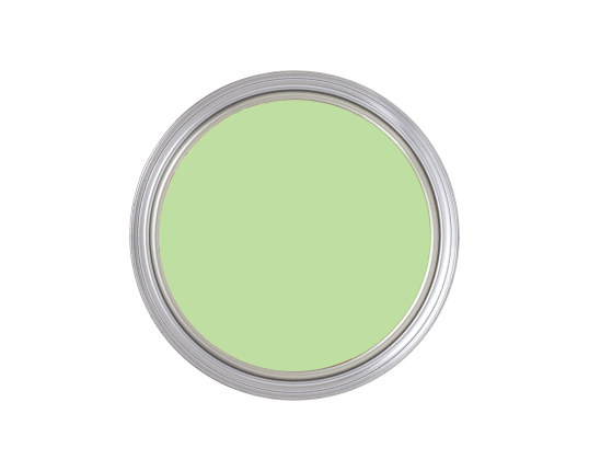
Benjamin Moore Sounds of Nature
“The kitchen is an area where you need to feel relaxed yet energized enough to cook and possibly entertain while doing so. Greens, specifically spring greens with heavy yellow undertones like Benjamin Moore’s Sounds of Nature and Shimmering Lime, are great examples that evoke both rejuvenation and transformation. The color can be used on the cabinets, walls, and the ceiling to help define small urban spaces, and pops of the color can be naturally introduced through plants and herb gardens, kitchen accessories, and dishware.” —Lori Weitzner, designer and author of Ode to Color
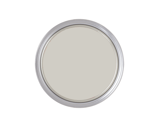
“This is an ethereal gray that provides just a hint of color. Nimbus creates a calm and inviting backdrop for your kitchen when applied to the walls and is incredibly versatile. It changes throughout the day depending on the light. Therefore, it will complement any decor style. If you are feeling bold, pair it with deep blue or, dark grey cabinetry—Hale Navy and Chelsea Grey work great—and brass finishes.” —Jacquelin C. Franklin, designer and Thumbtack pro
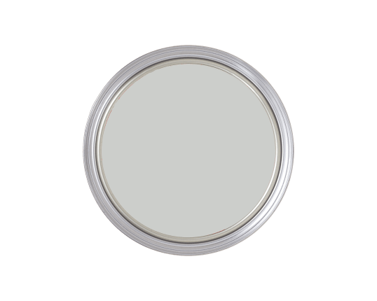
“Soft and subtle, with just a touch of warm tone to it. Skylight is one of those colors that works perfectly as wall paint or even the ceiling color.” —Bradley Odom, founder of Dixon Rye
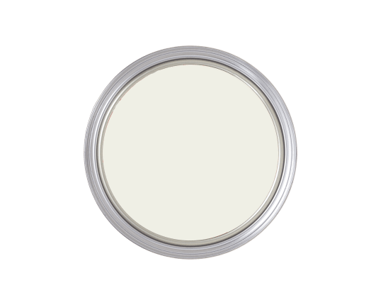
“It’s a nicely balanced white that doesn’t skew too warm or cool for all different lighting styles. It can be coordinated perfectly with White Dove (cut down to 50 percent) for the cabinets. Creating these subtle differences will help distinguish between the elements, yet leave your space with a perfect tone-on-tone aesthetic. Of course, tone-on-tone is not for everyone, but choosing White Dovefor your walls will work for any color cabinets and be the perfect contrasting backdrop. Some fun cabinet colors that won’t wash out on the white background are Benjamin Moore Hale Navy or Benjamin Moore Hunter Green.” —Tracy Lynn, designer
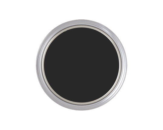
“If you want to go outside the box, try a black wall with a white kitchen. Dark, rich colors really accentuate cabinetry, windows, and trim. It gives a beautiful blank canvas.” —Sarah Fishburne, The Home Depot director of trend and design
“My latest favorite color for kitchens is Farrow & Ball’s Inchyra Blue—it’s sexy and comforting and represents the warmth of the hearth and hospitality. It looks great with brass fixtures, and brings a bit of color to a stark modern kitchen. I’ve noticed it also puts people at ease.” —Mally Skok, designer
